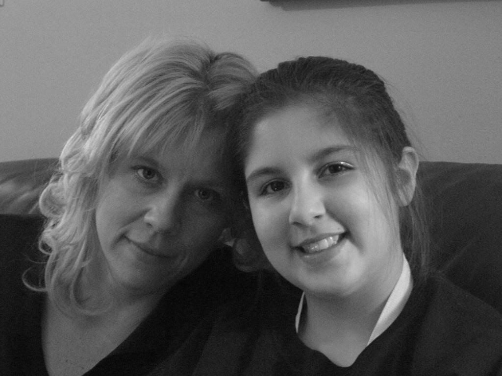
I'm still trying to fix the template. I can't seem to get the header right. I kinda like the way my eye is peeking at you when you open the page. I need help with getting a logo or something in for the title. Ugh! I'm sick of trying but will keep on keeping on 'cause that's just how I am. Never give up (unless it's exercise)!
Let me know if you think something is askew. I have several computers and it looks different on all of them using the same browser. I tend to use Firefox most of the time.
Anywho, bear with me and if you have any helpful hints, they would be greatly appreciated.
I'm All A'Twitter
Monday, April 10, 2006
Still Working
Posted by
SignGurl
at
10:42 AM
![]()
Subscribe to:
Post Comments (Atom)


7 comments:
I LOVE the blue, and the picture of you peaking out is very appropriate, definitely keep that. As for help, I'm an html beginner at best ;)
I like the pic of you peeking out also..maybe madame x can offer some suggestions.
tc
Jenn, that header brings out your true personality. You look like a voyeur. ;)
Sorry I can't help, I use dreamwever for my real life websites and can barely get my blog to look right. I think it looks purdy though and I love the blue shade you used! Missed you!
you're WAY more ambitious than me when it comes to blogging stuff. i'm lucky if i get a post a week in lately. but yours is looking very nice! good job.
I like what you have so far. I love the blue and the picture of you peeking out~cute!
Well what do you want to do to the header then? Let me know
Post a Comment